When you are in the business of building brands – building your own can be quite daunting. It’s a measure by which others will determine whether or not you are good at what you do – so that’s kind of scary. It’s also your very own, and you want it to be so perfectly right – yup, pile on more of the palm sweating scary. And you want it to vibrate, resonate, engage, sizzle and shine while telling your story (the one you keep a little too close to the vest). Tall order.
But … an irresistibly, expansive tall order!
One of the nicest compliments I have ever received was from a client, after presenting her with a snazzy new business name, visual identity and tagline she said “you listen on a whole different level”.
So I listened …
What could this little company of mine offer the world?
Clarity, beauty, and growth was the answer that roared out loud.
What do I believe the world needs more of?
Businesses who understand how powerful their story is. And people who know how to own their story. Combining the two? Well, that’s where the irresistibly, expansive bit comes in.
Who did I want to work with?
Difference makers.
What could only the Story co do?
Listen on a whole new level. Hear the story, and find its power. Connect the dots.
(And if you know me at all just the mention of the word dots gets my visual senses tingling. So of course dots were going to part of this wonderful adventure but I digress)
So I flushed out a business plan all the while keeping these statements near and dear. And only when the strategic process was complete did we start the visual identity and naming process.
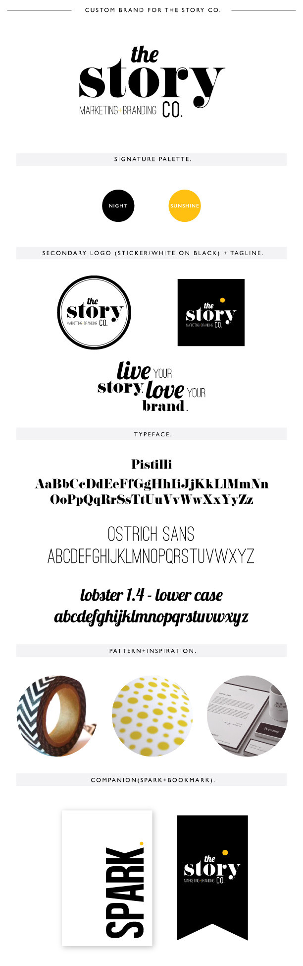
The name the Story co and the tagline: live your story, love your brand. That came naturally. Live+love, hell yes I want to spend my life doing exactly that.
Story + brand – well that was me in a nutshell.
Next up …
Fonts – oh for the love of fonts!! So many, many, many beautiful fonts! The ever brilliant Kelly Hogan, Story co font wizard and design guru said “hmmm how about something that hints back to days gone by to the place where we first got the story – the newspaper. Bam! Font selected. And all encased in a circle – well you know now that I love circles. Playful, unending, inclusive, strong. Yup – needed that!
Colours – I’ve got some really deep love for colour! But those old newspapers were just black and white. The starkness, clarity and simple beauty reflected the brand. Wanted that.
And the finishing touch – the yellow dot. (just one – showed I am capable of some restraint). Yellow dot thinking has become our philosophy, our framework, our trademark. That little dot is the hero of your story. It is the best of you, it is what makes you stand out in a crowd, shine like the sun, and smile silly.
And so that’s how the he Story co brand was born and each day it is a whole lot of fun to find ways to live my story, and love my brand. Always comes back to love, doesn’t it?